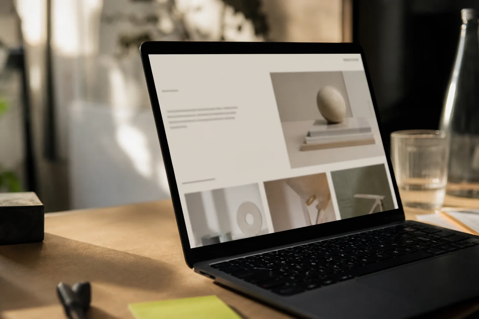
The first screen sets reading conditions
A useful first screen answers enough to let the visitor continue: whose site this is, what kind of offer is being presented, and where the page wants attention next. It does not need to contain the full sales argument.
Crowding weakens that first decision. Several large headings, equal-weight buttons, badges, and moving elements force the visitor to decide what the designer should have decided. Empty space helps only when it clarifies relationships; large gaps without structure create a different kind of confusion.
We prefer to test the first screen as a reading sequence. Cover the logo and ask whether the category is still clear. Remove the color and see whether hierarchy survives. Check the same composition on a narrow phone, where vague priorities become obvious quickly.
Identity lives in repeated decisions
Typography, spacing, image treatment, button language, and motion establish a visual grammar. The grammar becomes recognizable because it continues across service pages, contact forms, project cases, and operational screens.
Inconsistency usually enters through small exceptions. A new page uses a different radius. A campaign introduces another accent color. The admin panel falls back to unrelated components. Each exception looks minor, but together they make the business feel assembled from separate sources.
A project-specific component system gives those decisions a home. It allows the brand to expand without asking a designer to reinterpret the basics on every page.
Motion establishes the page's pace
Animation can reveal order, explain a transition, or direct attention. It becomes a distraction when text moves while someone is reading, when every card performs the same entrance, or when the page delays access to information for spectacle.
The appropriate pace depends on the business. A fashion label and an operations panel can share high production standards while using very different motion. In both cases, the interface should respond quickly, respect reduced-motion preferences, and stop when the purpose of the movement is complete.
Sound and autoplay deserve even more restraint. A visitor should keep control over the environment, especially on a business website opened at work or on a phone.
Audit the system before redrawing the mark
Take screenshots of the homepage, one service page, the contact route, a common mobile screen, and any customer-facing email or panel. Place them together. Look for changes in type scale, margins, image crop, button wording, and visual density.
Then write the one sentence the first screen needs to carry. Choose one primary action and decide which proof should appear close enough to support it. This gives the redesign an editorial brief instead of a collection of style references.
Write the decisions where designers and developers will use them: the type scale, spacing rules, color roles, image treatment, and primary action. The next page should inherit those choices without reopening the same debate.